Accessibility, SEO and AI Agents: Why Semantic HTML Improves More Than Compliance
A practical guide to semantic HTML, keyboard access, forms, alt text and accessible interaction patterns that also improve crawlability and machine understanding.

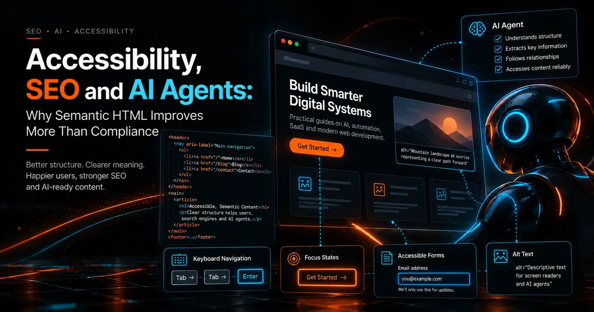
Accessibility is often treated as a final checklist. That is a mistake.
The same design decisions that make a website easier for people using keyboards, screen readers or alternative input methods often make the page structure more explicit for browsers, crawlers and automated systems.
This does not mean accessibility is an SEO tactic. Accessibility has its own human purpose. The overlap exists because both accessible interfaces and machine readable interfaces benefit from clear semantics and predictable behavior.
The W3C Web Accessibility Initiative explains core accessibility principles in Accessibility Principles.
Use the element that matches the job
Semantic HTML reduces ambiguity.
Use:
<button>for actions.<a href>for navigation.<nav>for navigation regions.<main>for the primary content.- Proper heading levels for document structure.
<label>elements for form controls.- Lists for actual lists.
- Tables for tabular data rather than layout.
A clickable div can be made to behave like a button, but then you have to recreate keyboard behavior, focus handling and accessible naming that a real button already provides.
W3C technique H91 specifically highlights standard HTML controls and links as a way to support keyboard operation and assistive technology interoperability: Using HTML form controls and links.
Headings are information architecture
Heading levels should describe the content hierarchy, not simply font size.
A practical article structure might be:
- H1: one primary page topic
- H2: major sections
- H3: subsections inside an H2
Do not choose H4 because it looks smaller. Use CSS for appearance and HTML for meaning.
This helps screen reader navigation and makes the document easier to parse programmatically.
Keyboard access is a product requirement
Test the entire public site using only a keyboard.
You should be able to:
- Reach navigation links.
- Open and close menus.
- Activate buttons.
- Complete forms.
- See a visible focus indicator.
- Escape dialogs or overlays.
- Avoid getting trapped inside any component.
A custom component that works perfectly with a mouse but fails with Tab and Enter is incomplete.
W3C notes that many users rely on keyboard interaction and that functionality available by mouse should also be available by keyboard.
Accessible names matter
Icons alone can be ambiguous.
A menu button should have an accessible label. A form field should have a real label. An image link should communicate the destination.
For icon only controls, an aria-label may be appropriate when visible text is not practical. But ARIA should supplement good HTML rather than replace it.
A useful rule is: native semantics first, ARIA second.
Alt text should explain purpose, not keywords
Good alt text is contextual.
For a decorative glow or background texture, empty alt text may be correct.
For a screenshot that demonstrates a workflow, the alt text should describe the useful information in the screenshot.
For a portrait on an author page, the person's name may be enough depending on context.
Do not turn alt attributes into lists of SEO keywords. Google Search Essentials recommends descriptive alt text as one place where useful words can help explain content, but the description should remain natural and accurate. See Google Search Essentials.
Forms need more than placeholders
Placeholder text is not a reliable substitute for a label. It disappears when the user types and may be difficult to interpret.
For each important form field:
- Provide a programmatic label.
- Mark required fields clearly.
- Explain formatting requirements before submission.
- Associate error messages with the correct field.
- Preserve entered data when validation fails where possible.
- Make success states clear.
For a lead form, this is both an accessibility issue and a conversion issue.
Motion needs restraint
Animations can create a polished identity, but they should not make content difficult to consume.
Respect prefers-reduced-motion. Avoid making essential content available only through an animation. Be cautious with continuous motion, scroll hijacking and effects that move the interface away from the user's expected position.
The best effect is the one that does not compromise reading or interaction.
Semantic HTML and AI agents
Automated agents need predictable controls and explicit states.
A real button with a useful name is easier to reason about than an unlabeled custom element. A form with labels is easier to interpret than a visual-only interface. Stable URLs and clear headings create a more legible task path.
That does not mean an accessible page is automatically "AI agent optimized." It means accessibility reduces ambiguity in the interface, which is useful to people and machines.
For broader agent readiness, see How to Optimize a Website for AI Agents.
Accessibility and JavaScript
JavaScript can enhance accessible experiences when state is managed correctly. It can also remove native behavior.
When a script opens a modal, ask:
- Does focus move into the modal?
- Can the user close it with the keyboard?
- Does focus return to the triggering control?
- Is background content prevented from receiving accidental focus?
- Is the modal's purpose announced meaningfully?
When a script swaps page content, ask whether the new state is understandable without relying only on color or animation.
A practical audit
Run this audit on the homepage, navigation, contact form and at least one long article.
Structure
- One clear H1.
- Logical heading order.
- Landmark elements used appropriately.
- Real links for navigation.
Interaction
- Full keyboard operation.
- Visible focus.
- No keyboard traps.
- Touch targets are comfortable on mobile.
Media
- Informative images have useful alt text.
- Decorative images do not create noise for screen readers.
- Videos have appropriate alternatives when relevant.
Forms
- Every input has a label.
- Errors are specific.
- Instructions are not color only.
Motion
- Reduced motion preference is respected.
- Content does not disappear because an animation failed.
That last item is worth emphasizing. A visual animation should never be the only thing making critical content visible.
What to measure
Accessibility is not completely represented by one automated score. Automated tools can find many issues, but manual keyboard and screen reader checks remain valuable.
Track both technical and behavioral signals:
- Automated accessibility findings.
- Keyboard completion of primary tasks.
- Form error rate.
- Mobile abandonment around interactive components.
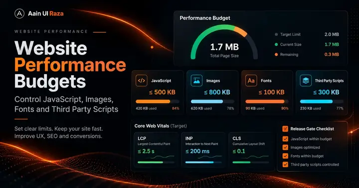
- Core Web Vitals after adding or removing interface effects.
Final principle
A strong website does not require users to understand the implementation.
Clear HTML, predictable controls, meaningful labels and restrained motion create an interface that is easier to navigate, easier to maintain, easier to crawl and easier to automate against.
That is not a shortcut to rankings. It is simply better web engineering.
Co-Founder of Strat IQ Digital and builder of CrawlerQue and Stratly Digital, based in West Palm Beach, FL. I work on AI products, SaaS, SEO intelligence, CRM automation and growth systems.